Hey Bombers and Blümers,
Last week we shared progress on the Blüm web3 app itself, which we’re happy to say is now 99% complete! The only thing left is to add the additional staking options and it will be good to go. The next, and most important step, is to have a welcoming and easy-to-understand website for first-time visitors to learn about Blüm. You will see that we have significantly deviated from your typical crypto site in our designs in order to appeal to as wide a demographic as possible with themes focused on: trust, ease-of-use, approachability, and success.
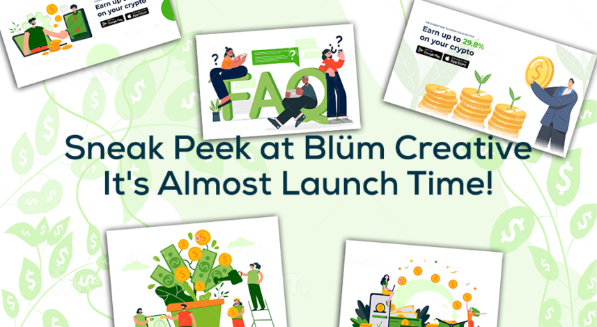
Without further ado, we present the first draft of the design and theme of the webpage. Note that it’s all still in segments and we will build it once we have made a few touchups and slight modifications to the images, but this is pretty much the finished design.
Blüm Finance Main Landing Page Hero Image (Draft)

Blüm Finance FAQ Hero Image (Draft)

Blüm Finance Refer a Friend Hero Image (Draft)
We will also be using a lot of the same colouring and themes in our marketing campaigns which we hope will be eye-catching and provide familiarity to ad-clickers once they land on our page!
Stay tuned next week as we release the official Blüm Finance website and announce our official app and marketing launch dates!


